


At Netcore Cloud, we’re always thinking about how you work — not just what you can build with our platform, but how effortlessly you can build it. Every click, every scroll, every moment spent searching for the right option adds up. And over time, we heard you: the platform could do a better job of staying out of your way.
So we went back to the drawing board — not to reinvent what Netcore does, but to make sure the experience of using it feels as powerful as the outcomes it delivers.
Here’s a look at everything we’ve improved.
More Space for What Matters
The best interface is one that fades into the background.
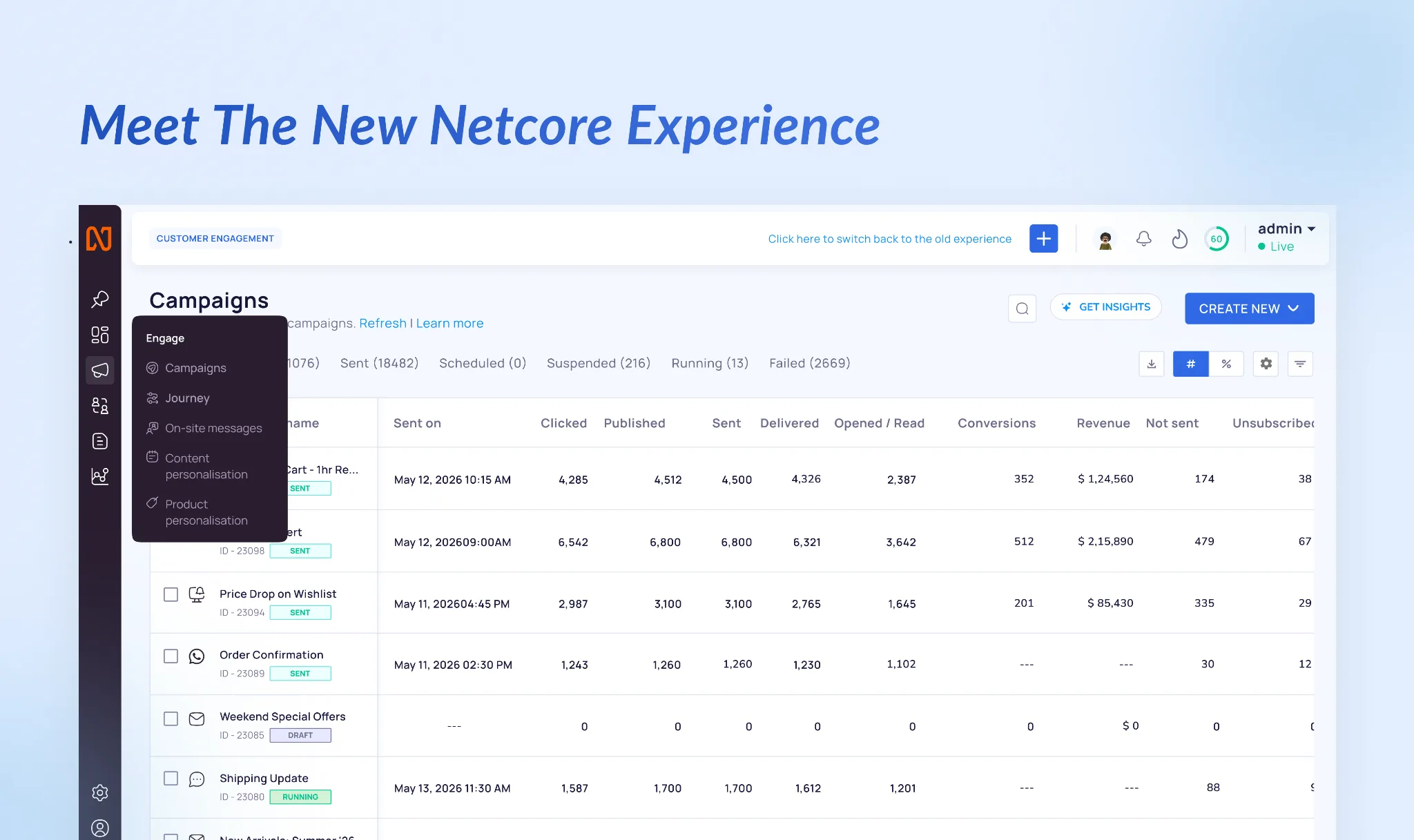
Over time, we’ve learned that every pixel of the workspace matters. Whether you’re building campaigns, analyzing customer journeys, or reviewing performance, your attention should be on your work—not on navigating the platform.
That’s why we’ve redesigned Netcore’s navigation experience.
The new navigation is slimmer, cleaner, and more intuitive, giving you more room to focus on your campaigns, journeys, reports, and dashboards. By reducing visual clutter and streamlining access, we’ve created a workspace that feels lighter, faster, and more efficient.
Less navigation. More momentum.
Your Workspace, Your Way
The fastest navigation is the one that’s personalized.
With the new Pinned Items section, you can save your most-used pages directly to the navigation bar for one-click access. Whether it’s Journeys, Campaigns, Analytics, or any other page you visit regularly, your favorites are always within reach.
No more navigating through menus to find the same pages again and again. Simply pin what matters most and create a workspace that matches the way you work.
Create Anything in Fewer Clicks
Creating is one of the most common actions across Netcore. So we asked ourselves a simple question:
Why should creating something new ever feel like work?
We’ve introduced faster creation pathways throughout the platform to help you move from idea to execution without interruption.
Everything You Can Create, Right Where You Need It
The new + Create menu in the top navigation brings all creation options into a single, organized view. Campaigns, journeys, segments, and more are now grouped logically, making it easier to find exactly what you’re looking for.
No searching. No guesswork. Just click and create.
Contextual Creation, Built Into Your Workflow
When you’re already working within a module, the most likely next step is often creating something new.
That’s why you’ll now find a dedicated Create New action directly within relevant pages. Whether you’re viewing campaigns, segments, or journeys, you can start building immediately—without navigating away from your current context.
The result? Fewer clicks, less friction, and a smoother workflow.
A Design Language Built for Clarity
Across the platform, we’ve refreshed our visual system with a modern, consistent iconography designed to improve recognition and reduce cognitive load.
The new icons are clearer, more intuitive, and easier to scan, helping you move confidently between features and workflows without stopping to think about where things live.
Designed to Help You Move Faster
This refresh isn’t about making Netcore look different.
It’s about making Netcore work better.
Every navigation improvement, every workflow enhancement, and every visual refinement has been guided by a single goal: helping you accomplish more with less effort.
This is just the beginning of the next chapter for Netcore.
We’re excited for you to explore the new experience—and we’re even more excited about what’s coming next.
As always, we’d love to hear your feedback. Reach out to your Netcore account team or share your thoughts directly within the platform.
Welcome to the new Netcore.

